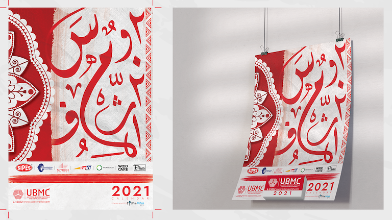
Sipes Paint Colors is a legacy paint brand known for its high-performance coatings, rich color selection, and innovation in decorative and industrial paints. With a strong history in the region, Sipes needed a modern brand refresh that would maintain its credibility while positioning it as a go-to choice for both professional painters and DIY enthusiasts. The objective was to highlight its color expertise and product quality through a cohesive, contemporary brand identity.
CHALLENGES & APPROACH
The core challenge was to evolve the Sipes brand into a more emotionally resonant and visually engaging identity—without losing the trust and recognition it had built over decades. Our approach was to emphasize the power of color in transforming spaces. We reimagined the visual identity with a sleek, modernized logo and a bold, versatile color system inspired by the most in-demand paint shades. The brand language was crafted to evoke creativity, durability, and inspiration. We also developed color catalog designs, in-store displays, and digital content. SEO played a vital role—we built targeted content using high-traffic search terms such as “best wall paint colors,” “interior paint ideas Egypt,” “durable exterior paints,” and “color trends in paint,” helping improve online search visibility and customer engagement.
THE RESULT
The rebranding of Sipes Paint Colors elevated its market presence and revitalized its appeal across generations. Customers now associate the brand with quality, innovation, and design-forward thinking. Enhanced packaging, a user-friendly digital experience, and SEO-optimized content led to increased online traffic, stronger brand loyalty, and a growing reputation as a trusted authority in color and paint solutions.